What's so wrong with Comic Sans?
- Published
Comic Sans, that unassuming jaunty typeface lurking inside millions of computers, has become the target of an online hate campaign. Simon Garfield explains why normally mild-mannered people are so enraged by its use.
How did schools ever advertise their Christmas fairs without it? Has a homemade birthday card ever looked so friendly written in anything else? Have type lovers ever found anything they loathe as much?
If you wrote these questions in Comic Sans you'd have something that was warm, inoffensive and rather unsuitable, a typeface that's gone wrong. And you'd also have something guaranteed to provoke a howl of protest.
Comic Sans is unique: used the world over, it's a typeface that doesn't really want to be type. It looks homely and handwritten, something perfect for things we deem to be fun and liberating. Great for the awnings of toyshops, less good on news websites or on gravestones and the sides of ambulances.
Last year it stuck out like an unfunny joke in Time magazine and Adidas adverts, and even the BBC wasn't immune, choosing the font to promote its Composers of the Year during the Proms.
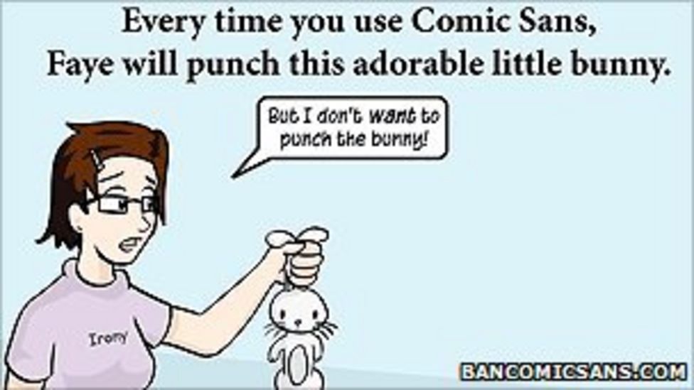
What can be done? One can buy the "Ban Comic Sans" mugs, caps and T-shirts, and help finance a documentary called Comic Sans, Or the Most Hated Font In The World.
Black-tie do (not)
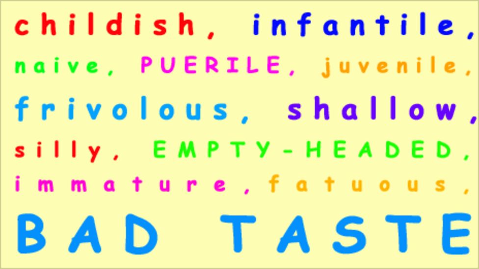
Holly and David Combs, the husband and wife cottage industry behind bancomicsans.com, argue that the misuse of the font is "analogous to showing up for a black tie event in a clown costume". Some of what the Combses have to say is tongue-in-cheek, but it is hard to disagree with their claims that type - used well or badly - has the ability to express meaning far beyond the basic words it clothes.
But why, more than any other font, has Comic Sans inspired so much revulsion?
Partly because its ubiquity has led to such misuse (or at least to uses far beyond its original intentions). And partly because it is so irritably simple, so apparently written by a small child. Helvetica is everywhere and simple too, but it usually has the air of modern Swiss sophistication about it, or at least corporate authority. Comic Sans just smirks at you, and begs to be printed in multiple colours.
Perhaps the most comic thing about Comic Sans is that it was never designed as a font for common use. It was intended merely as a perfect solution to a small corporate problem.
It was created in 1994 by Vincent Connare, who worked at Microsoft with the title of "typographic engineer".
Mrs Gates' role
In 1994, Connare looked at his computer screen and saw something strange. He was clicking his way through an unreleased trial copy of Microsoft Bob, a software package designed to be particularly user-friendly. It included a finance manager and a word processor, and for a time was the responsibility of Melinda French, who later became Mrs Bill Gates.
But the typeface it used was Times New Roman, which Connare judged to be a strange choice. It was a little harsh and schoolmasterly, not to say boring. It was not something that would hold your hand in a welcoming way.
Connare was a fan of the graphic novel, and was inspired by the speech bubbles to create something simple and rounded, letters that might have been created by cutting with blunt scissors (the truth is he used a popular font-making software package).
His font, not yet called Comic Sans, was rejected for technical reasons (it didn't fit the existing grids), but not long afterwards was adopted for the successful Microsoft Movie Maker. It was then included as a supplementary typeface in the Windows 95 operating system, where everyone with a PC could not only see it, but use it.
Better than Times New Roman
And thus it became a global phenomenon, something that would inspire attention from Design Week magazine to the Wall St Journal. Connare later explained why it worked so well: "'Because it's sometimes better than Times New Roman, that's why."
One thing the Comic Sans debate has demonstrated beyond doubt is that one's choice of font is now a serious affair.
Twenty years ago fonts were not something most of us gave much of a second thought. Unless we were in the print or design industries, fonts were something we accepted rather than chose.
The pull-down menu on our computers changed everything. Here was a way of expressing our intentions and emotions in a new way, a choice that stretched from digital updates of Garamond from the 16th Century up to modern screen fonts such as Georgia and Calibri.
We could employ the efficient Gill Sans for job applications or the more elegant Didot for wedding invitations. We could become familiar with the differences between serif faces and sans serifs, the former with feet and tips on their letters, the latter usually with a less formal air. And we could unleash a seemingly harmless childlike new font on a defenceless world.
Almost inevitably, the Comic Sans backlash has produced a backlash of its own. There are already signs that the font may be becoming retro-chic, in the same way that we now embrace 80s fashion and pop. Most significant of all, it has become highly regarded by those who work with dyslexic children - one of the better uses for which it was never intended.
Simon Garfield wrote this article in Georgia regular. He is the author of Just My Type: A Book About Fonts, published by Profile Books.